MOMOYA NYC
RESPONSIVE UI DESIGN
TOOLS USED
MY ROLE: UI Designer
DESIGN SPRINT: 2 Weeks
THE CLIENT:
Momoya is a traditional Japanese restaurant with a focus on sushi and sashimi. With two locations in NYC, they have been a staple in their respective neighborhoods.
THE TASK:
THE PROBLEM:
Our team was tasked with creating a conceptual redesign for Win Son’s website to improve the site’s usability and UI. In the latter half of our design sprint, we worked with a team of web developers to bring the redesigned website to life.
Parameters and Limitations
The scope of this project was limited to a visual UI redesign of Momoya’s website, thus formal research was not conducted in this design sprint.
Our UI team created detailed mock-ups for 3 site viewports (mobile, tablet, and desktop view) and 1 desktop prototype for the purposes of creating a responsive site. The designs were handed off to a team of developers who are currently still in the process of developing the redesigned product.
Momoya is a traditionalJapanese restaurant serving authentic cultural cuisine but their website does not visually convey their mission or personality.
How might we help Momoya align their web presence to their brand that is reflective of the type of food they serve while providing customers more information?
THE DESIGN
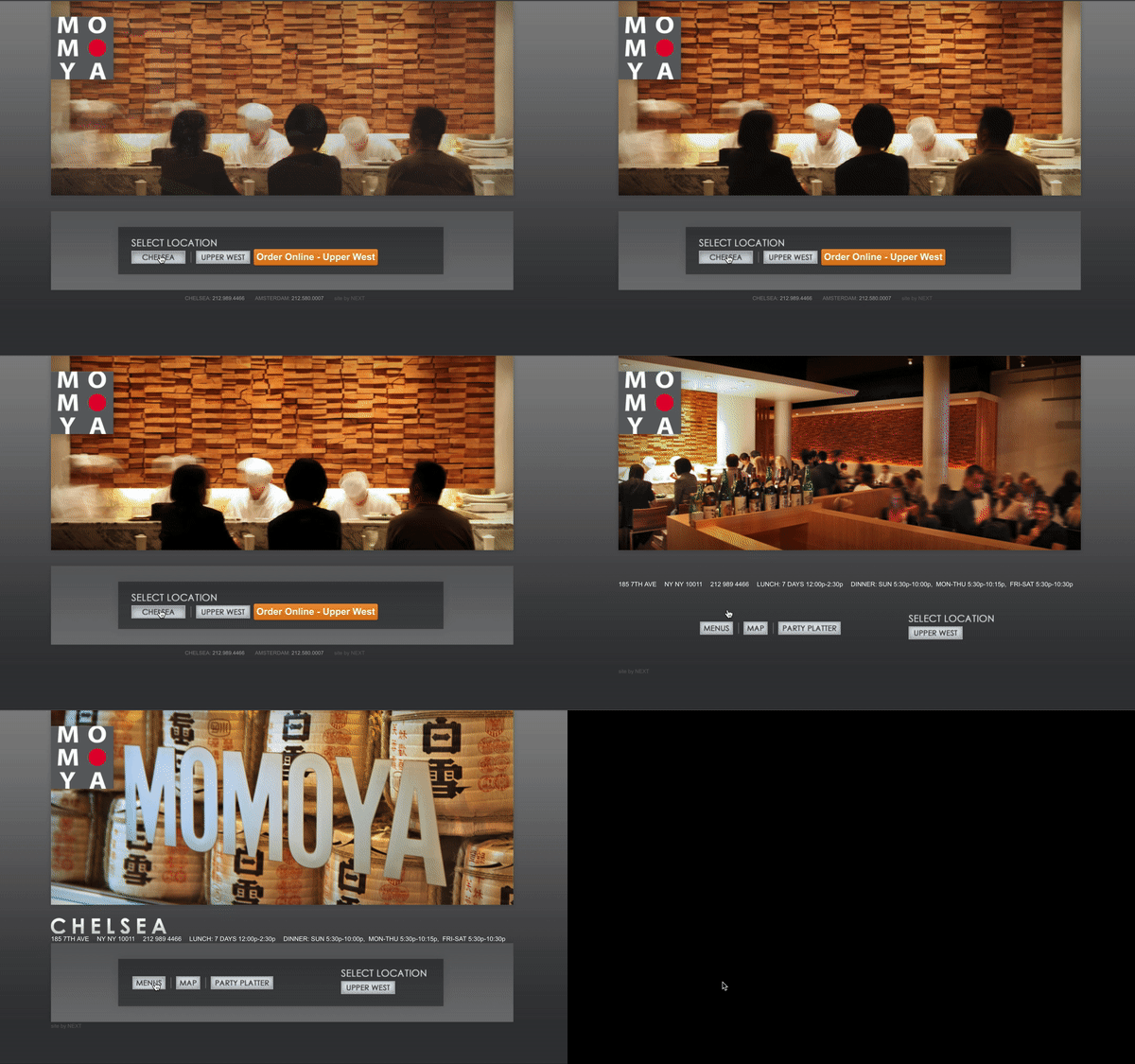
CURRENTLY
Current site has no global navigation.
No links to social media.
Poor visibility for menu.
Multiple external links.
Low visibility for hours and addresses.
DESIGNING WITH DEVELOPERS
Our UI team led a design studio session with the team of developers in participation. The session was comprised of 3 rounds of rapid, collaborative sketching accompanied by rounds of individual feedback. Together, we created a final sketch combining multiple sketches to represent our minimum viable product (MVP) which would also be the basis for initial wireframes and prototype.
BUILDING A RESPONSIVE SITE
To develop a responsive website, we created designs for three different viewports: mobile, tablet, and desktop. Designs for all viewports featured a sticky header/navigation on top and a single scrolling page.
MAJOR UI CHANGES:
• The mobile and tablet viewports have hamburger menus. Once clicked, an overlay appears with navigational options.
• Vibrant hero images in carousel gallery
• Made all links internal links
• Switching from location to location is done with a slider
HAND OFF TO DEVELOPERS
Trello Board detailing agile sprint plan
Assigned user stories
High-fidelity wireframes
Uploaded wireframes to Zeplin
InVision Prototype
Assets folder containing icons & images used
In-person stand-ups and communication through Slack
NEXT STEPS
Conduct a round of usability testing to test site functionality
Integrate an internal reservations system
Allow extra time for the developers to finish coding the site
Continue collaborating with the developers’ team until project completion


